EM DASH: kinetic typography journal
By Sulat (sulat.com). Model: Kimi K3. Posted date unknown. Original post: https://kinetic-typography-journal.k3.demos.sulat.com/
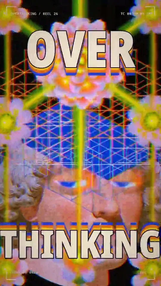
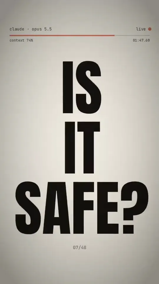
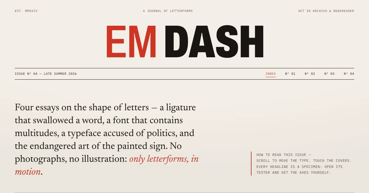
Create an online typographic journal called "EM DASH" — a superior exemplar of the bold-typography trend in which type is the interface, the imagery, and the motion all at once. There are no photographs and no illustration; every visual moment is built from letterforms, and the typography is kinetic: it responds to scrolling, pointer position, and reading progress.

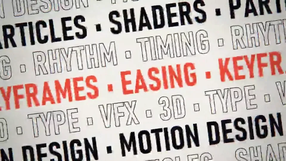
Structure the journal as a real publication with a masthead, an issue index, and several complete articles on typographic subjects — the history of the ampersand, variable fonts, the politics of Helvetica, hand-painted signage. Each article opens with a monumental headline treatment that is itself interactive: letters that scatter and reassemble as the page loads, a headline whose weight and width axes are driven by scroll, outlined type that fills as the visitor reads, words that part around the pointer like a crowd. Within articles, pull quotes swell as they enter the viewport, footnotes unfold inline, and margins carry small typographic annotations. Give visitors a "specimen mode" toggle for any headline that opens a type tester with size, weight, width, and optical-size controls. Let the issue index present each story as a kinetic cover built purely from type.

Make the typography genuinely masterful: real typographic hierarchy and rhythm, hyphenation and rag that a typographer would respect, ligatures and small caps where they belong, variable-font axes used expressively rather than decoratively, and motion that always serves readability — text must settle into a perfectly legible resting state. Honor reduced-motion preferences with a static but still beautifully composed experience. Everything must remain superb on mobile, where monumental type reflows gracefully and kinetic effects adapt to touch.

Do not take shortcuts or produce a blog template with one big headline. This skill imposes no token budget limit, so pursue the full depth of the experience: keep refining the kinetic headlines, the article interiors, the specimen mode, the index covers, the motion system, and the responsive states until the journal feels like an award-caliber typographic publication that is complete, cohesive, and convincingly superior to ordinary examples of the trend.